PANTONE Ultra Violet: Comment to Win!

PANTONE Color InstitutePantone has picked another winner for its Color of the Year!  It’s ULTRA VIOLET 18-3838, and it’s actually a great complement to last year’s wildly popular pic, GREENERY, as well as other shades of green, blue and purple.  Pantone says of the choice:

“Inventive and imaginative, Ultra Violet lights the way to what is yet to come. A dramatically provocative and thoughtful purple shade, PANTONE 18-3838 Ultra Violet communicates originality, ingenuity, and visionary thinking that points us toward the future.”   (Don’t you just love Pantone’s narratives?)

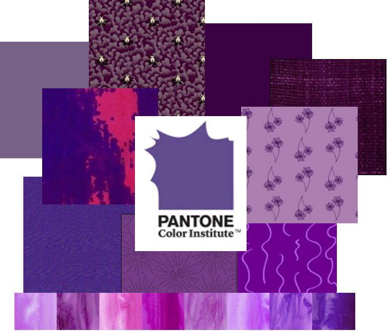
We’re sold! What do you think of this year’s star color?  Comment on Studio 37’s Instagram post by this Friday, January 26 for a chance to win a fabric bundle in honor of this year’s pick!


We Love Pantone’s GREENERY for 2017!

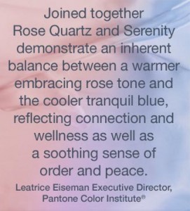
Like many of you, we fully approve of Pantone’s pick as Color of the Year for 2017 – it’s called GREENERY, and it gives us a sense of freshness, renewal and hope.  The world’s foremost color authority chose Greenery, also known as 15-0343, for these reasons:

“Greenery is a fresh and zesty yellow-green shade that evokes the first days of spring when nature’s greens revive, restore and renew. Illustrative of flourishing foliage and the lushness of the great outdoors, the fortifying attributes of Greenery signals consumers to take a deep breath, oxygenate and reinvigorate.”  Read more

If you’re lovinGreenery as much as we are, breathe deeply and rest assured we’ve got it covered, from Centennial Solids and Wools to designer prints and batiks:

greenery-swatchespantone17

Pantone’s Color(s) of the Year for 2016…

PantoneColors 2016For the first time, Pantone has blended TWO hues as their Color of the Year, making 2016 the Year of Rose Quartz (13-1520)  and Serenity (15-3919)

As Pantone explains it:  “As consumers seek mindfulness and well-being as an antidote to modern day stresses, welcoming colors that psychologically fulfill our yearning for reassurance and security are becoming more prominent.”

What do you think of this year’s double-pick?  Does it fit into your quilting & PinkBlueNancysewing plans?  Will you wear these Colors of the Year?  Decorate with them? (Personally, I’m sticking with MARSALA from 2015, which is included in the lineup of coordinates for this year’s choice.) 

See how Pantone is pairing up the colors with other hues.  Then check out ON PLUMBERRY LANE by Nancy Rink…

Feeling calmer already, aren’t you?    — lisa

pantonepinkblueSunset