While some of our staffers and designers are recovering from QuiltCon mania in Pasadena this past weekend, we thought we’d review three can’t-miss collections you’ll find in your favorite quilt shops now…plus, following the show, we’re still in Giveaway mode, so read on for details on how to enter and WIN a Studio 37 fabric bundle!
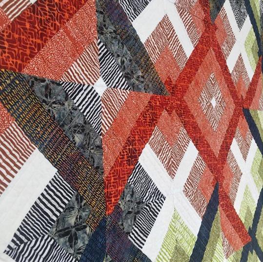
 IMBUE – Kim Eichler-Messmer’s debut collection for Studio 37 is a beautiful blend of artisan batiks. You’ll love her color sense, whether you use them all together, or combine just a few of the colors in a project, like Kim did in her “Robie” quilt design below.
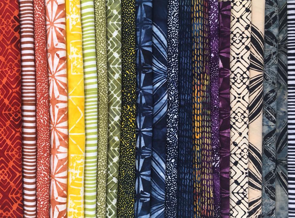
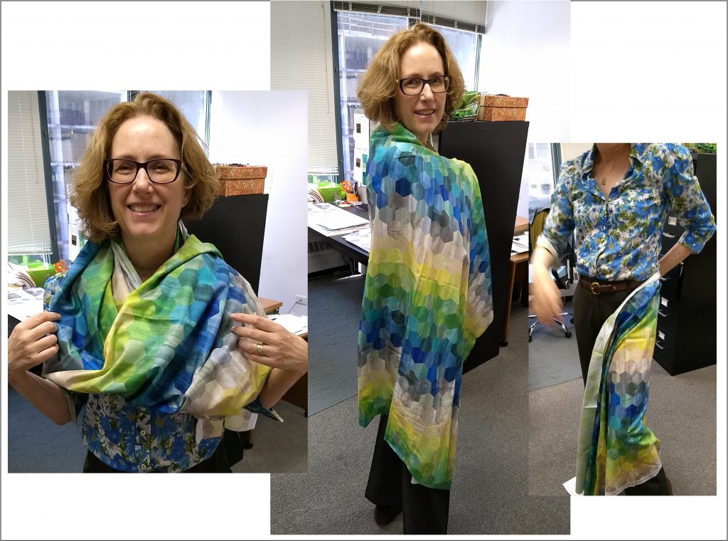
COLOR MOOD – Inspired by contemporary rainbow themes across various design categories, coupled with the vast technological capabilities of digital fabrics, Laura Berringer brings us a fun and exciting group, to be used as it is, or thoughtfully cut and re-pieced for limitless creative options…or, you could always just wrap yourself up in it until the right inspiration strikes ; )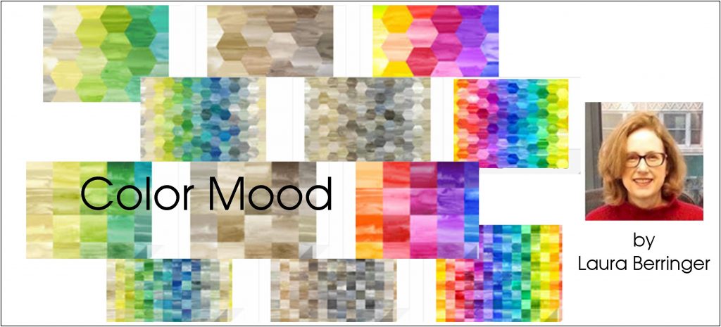
 PRIMO PLAID FLANNELS — At the same time, we love how well Laura’s COLOR MOOD plays with our best-selling yarn-dyed plaid flannels, now in Nancy Rink’s TWILIGHT TONES palette (we told you these Color Moods were fun!!) These bright and beautiful flannels are also in your local quilt shops now, so you can sew and enjoy them now through the spring season, and have a colorful headstart into next autumn, too…
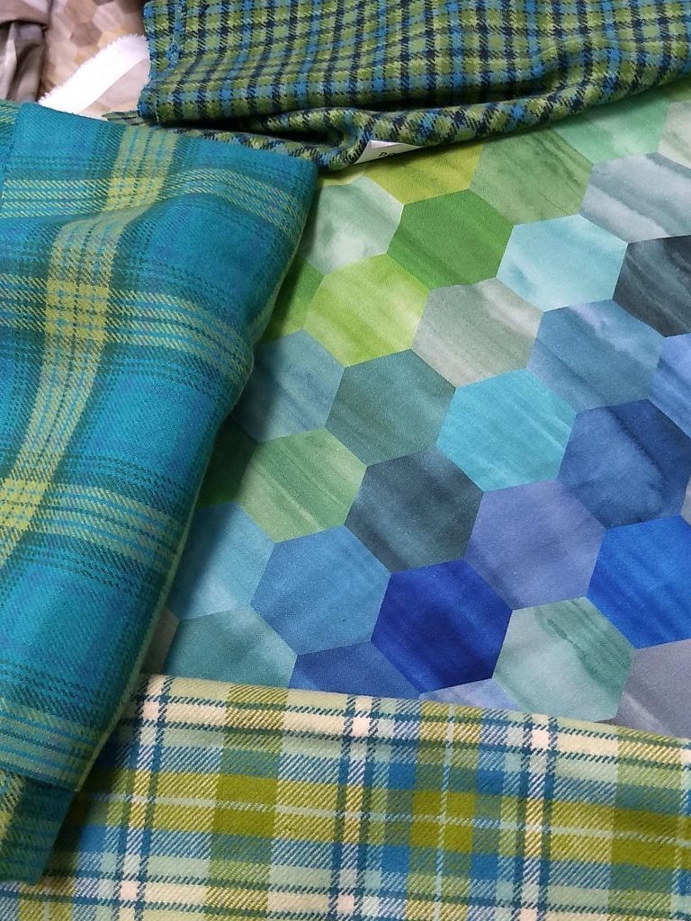
Now, about the GIVEAWAY: Just subscribe to our blog, then comment below on your favorite contemporary quilt trends, whether or not you attended Quilt Con. What color palettes, techniques or quilt styles draw you to the modern side? Comments received by Monday, March 6 will be entered into our random drawing for a bundle of contemporary inspiration!
i was unable to attend quiltcon….maybe someday…..i appreciate the simplicity of the quilts … simplicity in design is what draws me to shaker design and of course my love of all things amish. thank you for the generous giveaway janet jecagain@gmail.com
I love bright bold colors that come together to make interesting design compositions. We need to realize that we have a serious fabric addiction!!
I’m just a beginner but I love simple patterns with a modern twist.
I didn’t go to quilt con. I love the squash blossom there are so many modern quilts with that design.
I have always loved bright colors. I try to change up colors when I start a new quilt otherwise they would all be purple or teal.
I did not attend QuiltCon, but I sure enjoy seeing all the posts with pictures and tales from those who have! I tend to think of solids or near-solids for the “modern” vibe more than specific colors – and very saturated colors. I’ve been a subscriber for awhile and enjoy getting the news. Thx!
I am going to AQS in Daytona Beaxh! I hope to see some improv quilts which I think I would like to try. I LOVE these colors! And plaid flannel is a fav of mine
These fabrics and patterns are fantastic! There is nothing else to say.
I think black and white with a pop of bright color is my favorite modern trend. I’m a new e-mail subscriber!
I did go to Quiltcon — loved it! I’m a fan of batiks, and I’m really enjoying the “modern” trend with those fabrics.
I like how shades of gray have become the new favorite background color for many brights!
Laura’s color mode are great colors. Love to win giveaway.
I am enjoying the color palettes. Quilt Con is too far….maybe next year. I do like the minimalism, and all the negative space with all of the gorgeous quilting.
Love the colors. It’s nice to have something other than red.
I am in love with the Hexie Color Mood. I actually just love all of Color Mood. I will be looking for all of these fabrics.
No QuiltCon this year. I like the freedom of modern quilting, the anything can be anything and all the colors. I get concerned when artists start to label what is modern and what is not. I do not consider quilting in straight lines nor quilting so densely that you can’t see the fabric modern. Rather it and the quilts that have random blocks of color I consider abstract. And there is a place for all and it is exciting. Thanks
I Love the teal/green plaid flannels. Would make a lovely pair of snuggly jammies!
I’m really intrigued with the use of curves in piecing, and white space for lots of beautiful quilting.
I am a happy blog follower of Marcus Fabrics on Bloglovin’! I am completely drawn into any improv quilting designs. The bright colors, the curves and unusual lines make me swoon! I did not attend Quilt Con, but would love to someday!
I love the new collection, and have been subscribed to your blob forever. Especially love the Nancy Rink’s Twilight Tones. Those blues and purples look good enough to eat or at least wear.
Love all the ombre and metallic fabrics and the saturated colors! I hope some day that Quilt Con is close enough to me that I can attend.
Would love to play with these wonderful fabrics Marcus Fabrics has always been my go to.
Your Primo Plaid Flannels is typical of what I love about Quilt Con! These colors are very modern and work well wiell with a traditional block. Thes flannels will give me lots of freedom and permission, if you will, to challenge traditional motifs.
Thanks so much for a chance to win these fabulous new Fabrics!
I love the use of solid, and often bright, colors. The simplicity of the colors and contrasts really make a statement!
Although I did not attend Quilt Con, I wish that could have-someday I will!! The ombre color palettes appeal to me as do any quilts that have hexagons! I subscribe to your blog too.
I liked the use of thin stripes, especially liked best in show.
I just love the rich palette of Kim Eichler-Messmer’s new collection of batiks called Imbue. I would love to win some of these fabrics to make a quilt!
I love the look of batiks but I haven’t, as yet, sewn with any. I don’t go to Quilt Con mainly because I am too far away.
I like quilts that speak to me It doesn’t matter if it is traditional or modern. I did not get to Quiltcon this year, but maybe when it comes back to CA again, I will.
I don’t go to QuiltCon.
I LOVE bright colors!
I LOVE the Promo Plaid Flannels. Such a wonderful way to make your special someone a lap quilt! Thanks for the opportunity to in some of these.
I did not attend Quilt Con. I have an opportunity to go to the International Quilt Festival in Houston every year, and they have been expanding their modern quilt section, so I feel that is enough for me to see modern quilts in person. Also, I read a lot of blogs and follow people on Instagram, so I see examples of modern quilting everywhere everyday. I am inspired by minimal palettes and unexpected placement of traditional quilt blocks.
I did not attend Quilt Con. The primo plaids and other fabrics are awesome. I like odd fabrics as well as traditional prints. Have a fun day! angielovesgary2 atgmail dotcom
I’ve never been to QuiltCon, but hope to make it some day! I love the blues and greens!
Oh how pretty that IMBU is for that quilt! I would make a quilt with this bundle. I look forward to it’s arrival!
First thought of pallette colors are black, white, gray, red. Quiltcon 2018 was fun, I’m with my kind of people!!! So very sad it won’t be back in So. California in 2 years.
Such fresh new designs. I would love to win this. Thanks for the opportunity.
I love Laura’s Color Mood. Such subtle colors yet so vibrant. The batik’s are very beautiful as well.
Love the look of saturated solids mixed with prints & plaids.
I was unable to attend Quilt Con. I am drawn to the modern quilts because of their simplicity. My favorite colorway is anything in the cool color palette. Yarn dyed flannel fabric is the only flannel I use, yours is the prettiest out there.
I love minimalist quilting. Lots of white space. I skipped QuiltCon- too many people.
All of my quilts are colorful! With the new fabrics coming out, I’m set for making more colorful quilts!!
I’m loving all of the cool colors.
I did not get to attend Quiltcon. I am in love right now with the aqua teal and limey green colors. The batiks are gorgeous especially the indigo’s!
I like the modern traditionalism category.
Did not attend Quiltcon. Love bright colors with unique prints. Top picture, like the colors and prints.
I love the new variety of tone on tone fabrics – I do not attend Quilt Con
i did not attend QuiltCon. it seems as though bright colors shout modern….neon geometrics seem to be a mainstay of modern quilt…
I love the bright colors and interesting designs I see in more modern fabrics. Personally, I like blending these fabrics with more traditional blocks.
I did not go to QuiltCon. I am drawn to the use of traditional blocks made huge in some modern quilts; they look completely different.
I’ve always been drawn to reproduction, vintage and americana styles, but the newer modern quilts are really calling me. The batiks are stunning. I feel the need to jump a few centuries and try something new!!
I am not exactly drawn to the modern side. I enjoy a wide range of designs. I like designs that are “all over” not the stark ones with just a line or two on a blank background. I also like lots of color. My favorite colors are purple & aqua and shades thereof. I’m love scrappy quilts!
I didn’t attend Quilt Con…maybe “Someday” 🙂 I love the different modern arrangements’designs & fabrics in Modern Quilts..but also when Modern meets Traditional patterns too. Quilters have soooo many choices & ideas to create with now…it is AWESOME time to be a Quilter!! Thank you for chance to win your Give-a-way too! 🙂
I love the blue, teal, and green palette with a dash of yellow for contrast! I am a subscriber to your blog.
Love these collections. Unfortunately I didn’t go to Quiltcon but like the modern approach to color.
lovely fabric! I love bold saturated colors and striking design in my modern fabrics. I really enjoy the low volume backgrounds that are being used so that the quilting design is more prominent! I especially swoon over text fabrics – something about them gets my creative juices flowing! I really like polka dots and they seem to be very popular in modern circles. Really like the look of that hexie fabric – I can see lots of potential in it!!!
I like the bright colors and different patterns in modern quilting. I did not go to QuiltCon.
The Primo Plaids in Twilight tones and Laura’s Color Mood fabric are a fantastic combination and grreat inspiration
What great fabric to add to my stash!